From Uncertainty to Confidence
Transforming the application experience of Halo scientist dashboard
Transforming the application experience of Halo scientist dashboard
Transforming the application experience of Halo scientist dashboard
Halo is a technology partnering platform where 3,500+ scientists connect directly with leading companies like PepsiCo and Bayer for research collaborations and funding opportunities.
I joined Halo in Summer 2022 as a Product Design, collaborating closely with the Engineering team and the Growth Team to enhance user onboarding and proposal application experience.
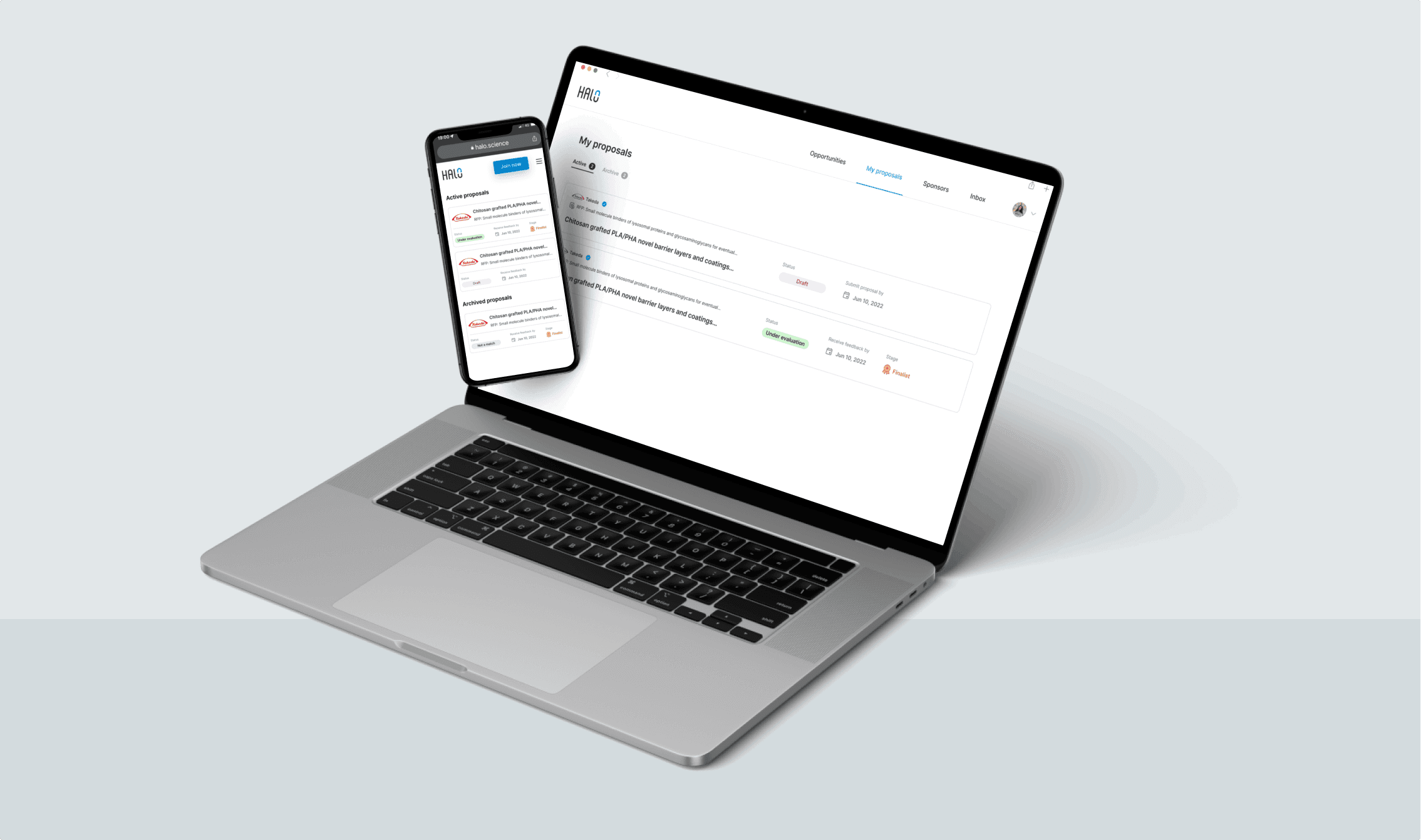


Improvement Overview
Improvement Overview
Improvement Overview
Time to Find "My Proposal" page was reduced from 10+ seconds to just 3 seconds.
Improved 90-day retention rate to 47%.
86% of users felt more confident securing research opportunities on the platform.
Time to Find "My Proposal" page was reduced from 10+ seconds to just 3 seconds.
Improved 90-day retention rate to 47%.
86% of users felt more confident securing research opportunities on the platform.


Plain and lack of information
Plain and lack of information


Engage with details
Engage with details
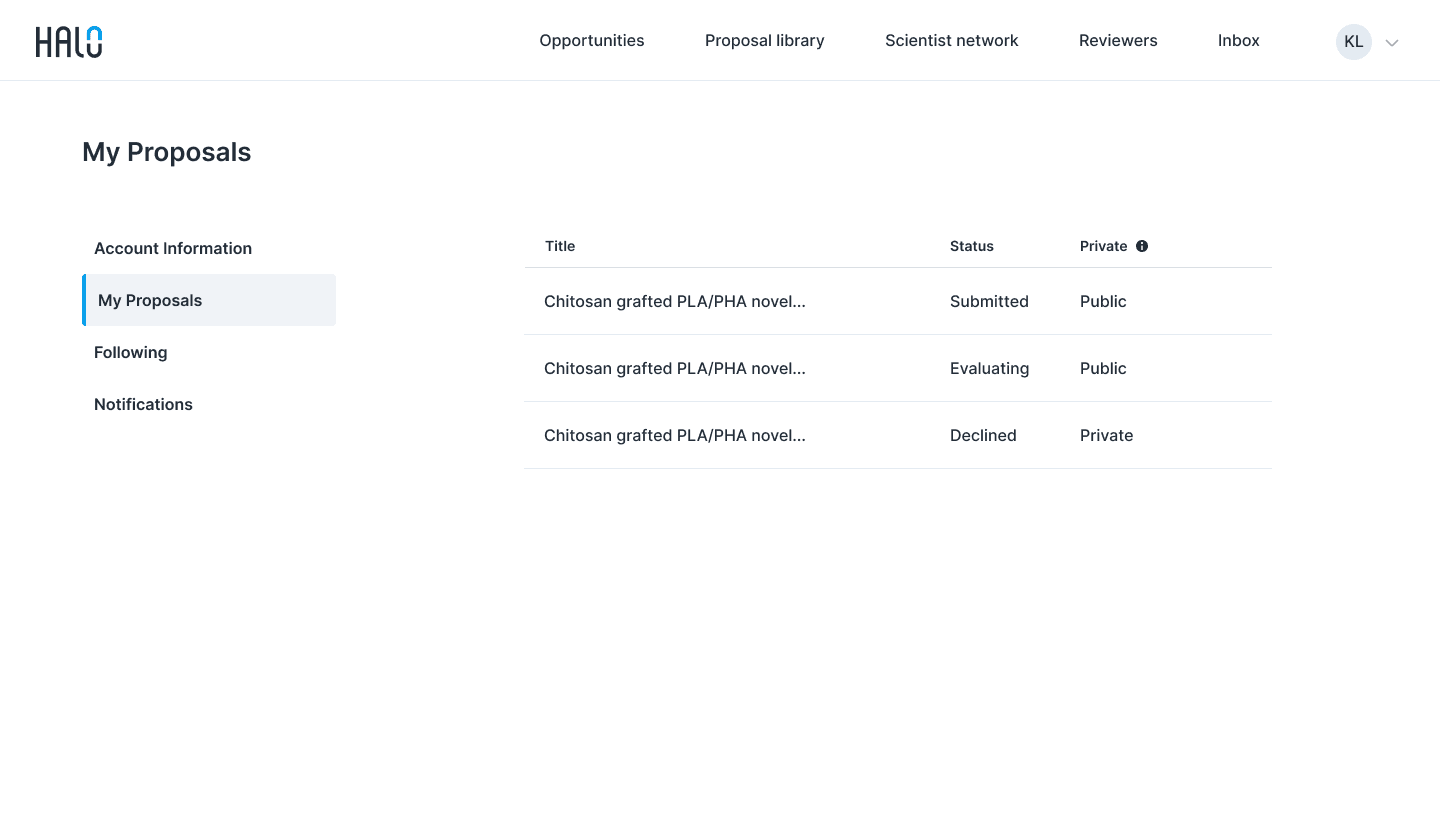

Hide away under User Profile
Hide away under User Profile


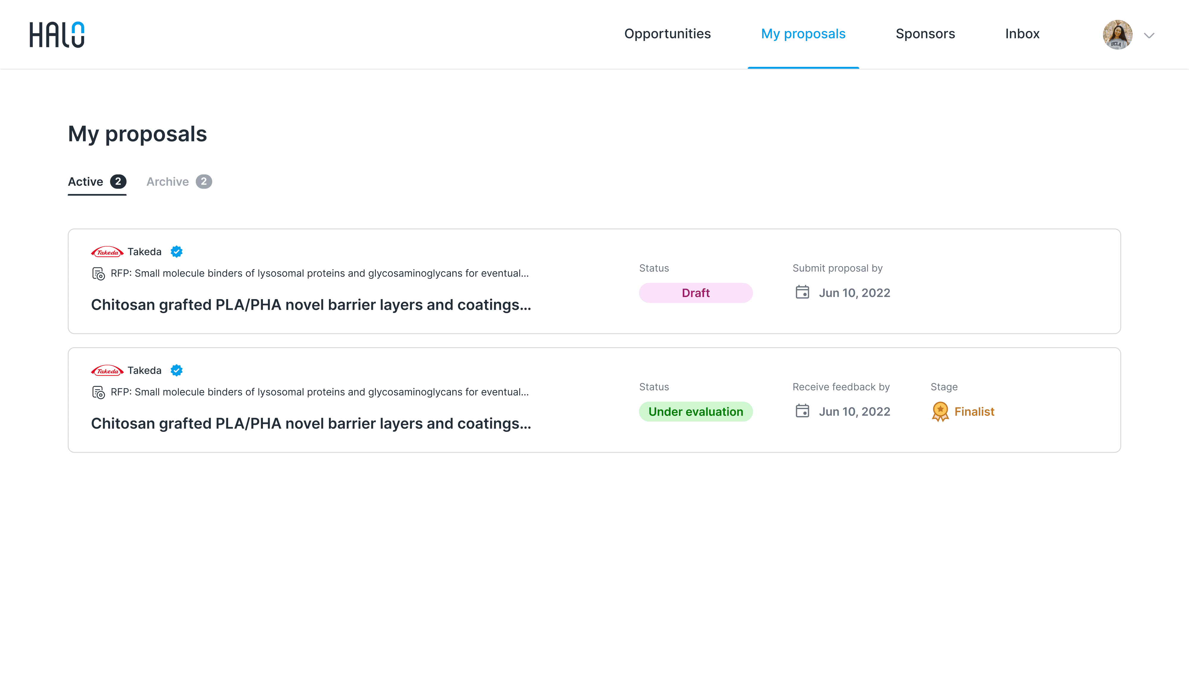

Easier to access from Header Menu
Easier to access from Header Menu
Initial Challenge
Initial Challenge
Initial Challenge
User drop-off after submitting just 1-2 applications
User drop-off after submitting just 1-2 applications
User drop-off after submitting just 1-2 applications
Halo aims to provide a platform where research scientists can directly connect with prominent sponsors and apply to their R&D requests. While attracting scientist users has never been a challenge, retaining them has proven difficult. Despite initial interest, many scientists disengage after submitting just 1-2 applications.
To find out why, we met with 6 previous users.
When & Why they stop using?
When & Why they stop using?
When & Why they stop using?
Scientists were lost and disappointed after applying
Scientists were lost and disappointed after applying
Scientists were lost and disappointed after applying


This lack of transparency made it difficult for them to gauge their chances, ultimately diminishing their confidence in the platform. To sum it up, users dropped the platform primarily for two reasons:
Too hard to track application status
"I applied for an opportunity and received a confirmation email, but no further follow up."
"I applied for an opportunity and received a confirmation email, but no further follow up."
Lose faith in the platform after repeated rejections
"I've applied to multiple opportunities and have never been selected, it's just a sense that this is not a good use of my time."
"I've applied to multiple opportunities and have never been selected, it's just a sense that this is not a good use of my time."
Refine Challenge
Refine Challenge
Refine Challenge
How might we keep scientists informed of
their proposal status and emphasize scientists' success?
How might we keep scientists informed of
their proposal status and emphasize scientists' success?
How might we keep scientists informed of
their proposal status and emphasize scientists' success?


Explore
Explore
Explore
Dissecting application process
Dissecting application process
Dissecting application process
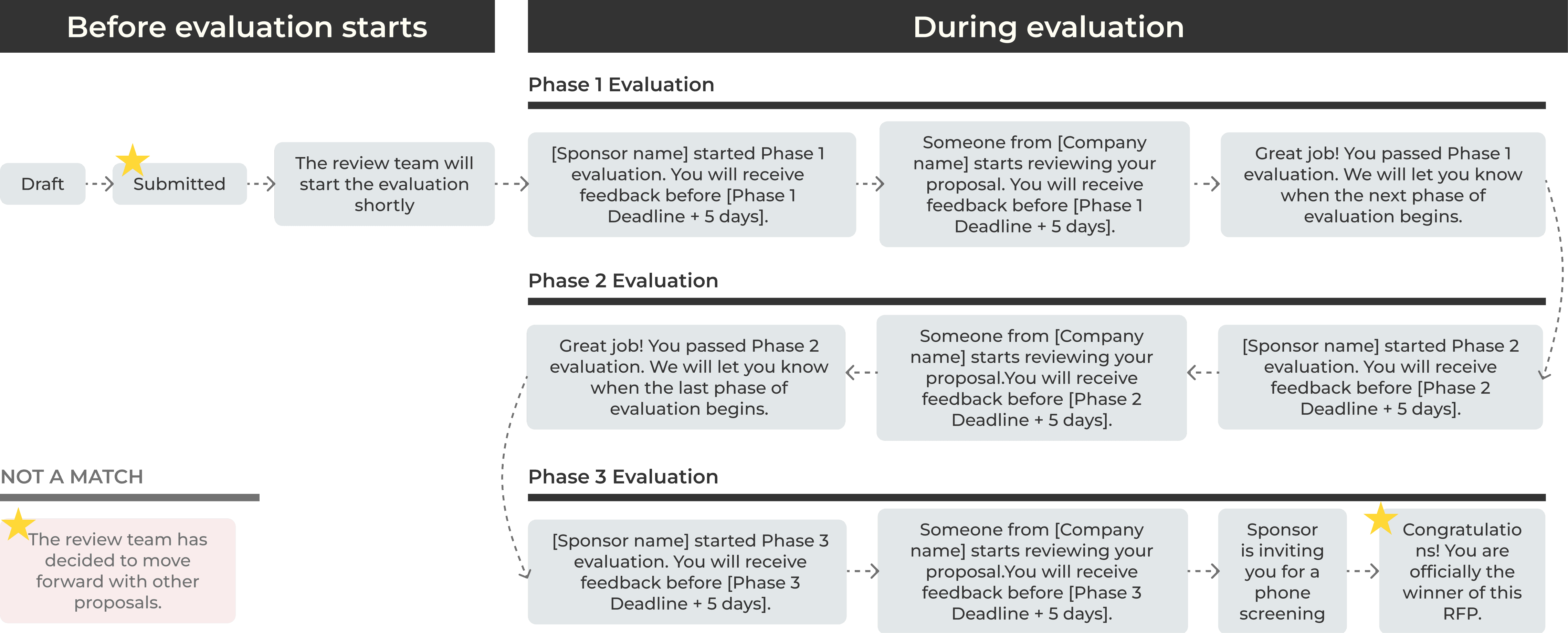
Rather than leaving scientist users waiting for months without feedback, we restructured the evaluation process into 3 different stages.
By tracking the application journeys of multiple scientists, I identified key points where timely updates could improve transparency and keep users engaged throughout the process.


Step 1: Redefine "Success"
Step 1: Redefine "Success"
Step 1: Redefine "Success"
Celebrating stage successes rather than just the final selection
Celebrating stage successes rather than just the final selection
Celebrating stage successes rather than just the final selection
We redefined the evaluation process as a 'matching' journey to better reflect its purpose. Applicants now receive badges to acknowledge their stage successes.
They also see 'Not a match' instead of 'Declined,' reinforcing that their proposal wasn’t rejected for quality reasons but because it didn’t align with companies' goals.
We redefined the evaluation process as a 'matching' journey to better reflect its purpose, focusing on celebrating stage successes rather than just the final selection.
Applicants now receive badges to acknowledge their stage successes. They also see 'Not a match' instead of 'Declined,' reinforcing that their proposal wasn’t rejected for quality reasons but because it didn’t align with companies' goals.

Qualified
Qualified
Qualified

Shortlisted
Shortlisted
Shortlisted

Finalist
Finalist
Finalist
Step 2: Transparent Status
Step 2: Transparent Status
Step 2: Transparent Status
Clarifying application process with color-coded tags
Clarifying application process with color-coded tags
Clarifying application process with color-coded tags
After identifying key application status touchpoints, I introduced reward badges, status tags, and expected feedback dates to enhance the proposal tracking experience for scientists.
I designed color-coded status tags for quick and intuitive identification, ensuring they aligned with brand guidelines and met accessibility standards.


Design Iterations
Design Iterations
Design Iterations
I prototyped 5+ proposal card designs, comparing layouts and visuals. Side-by-side displays improved cross-team discussions and elicited valuable user feedback during testing.
I prototyped 5+ proposal card designs, comparing layouts and visuals. Side-by-side displays improved cross-team discussions and elicited valuable user feedback during testing.


Progress bar is not rewarding nor accurate


Reward badge is not 'flashy' enough


Over emphasize on "Next Update Date"
Final Design
Final Design
Final Design
Design for Confidence
Design for Confidence
Design for Confidence
Users can now manage their applications through "My Proposal" section in the header menu, streamlining their workflow and enhancing productivity.
Users can now manage their applications through "My Proposal" section in the header menu, streamlining their workflow and enhancing productivity.
Accessible
Accessible
Accessible
Organized
Organized
Organized
In addition to managing application statuses, users can earn badges as a form of quality verification. These badges showcase the scientist's expertise and credibility, increasing their chances of securing future collaborations with other sponsors.
In addition to managing application statuses, users can earn badges as a form of quality verification. These badges showcase the scientist's expertise and credibility, increasing their chances of securing future collaborations with other sponsors.
Engagment
Engagment
Engagment
Retention
Retention
Retention
Other design improvement include…
Other design improvement include…
Landing Page
Reflection
Reflection
Reflection
Being flexible with tools
Being flexible with tools
I love being part of this fast-growing team, where there are ample opportunities to contribute. It pushes me to learn something new every day and apply my design skills across different contexts and platforms.
I love being part of this fast-growing team, where there are ample opportunities to contribute. It pushes me to learn something new every day and apply my design skills across different contexts and platforms.
Product is never truly built, it's a process of building and testing
Product is never truly built, it's a process of building and testing
Besides designing software features, I was also responsible for identifying usability issues through usability testing sessions and Smartlook investigations. I learned how small problems can lead to significant user experience challenges and experienced the satisfaction of resolving these issues through collaborative efforts with cross-functional teams.
Besides designing software features, I was also responsible for identifying usability issues through usability testing sessions and Smartlook investigations. I learned how small problems can lead to significant user experience challenges and experienced the satisfaction of resolving these issues through collaborative efforts with cross-functional teams.
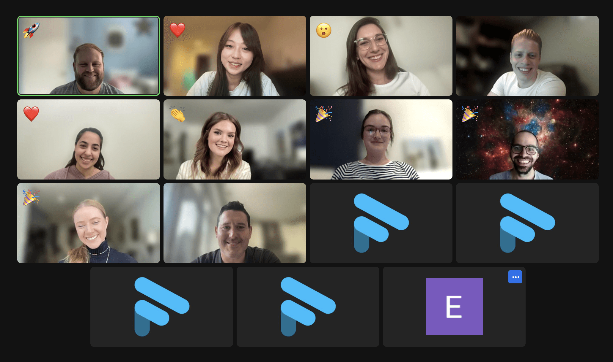

Halo Creative Team 🚀
Designed by Hailey Yixuan Li
Designed by Hailey Yixuan Li
Designed by Hailey Yixuan Li